Aury
Sole designer across the full product (brand, conversation UI and consumer app) for a clinically grounded mental health AI built to European regulatory standards.
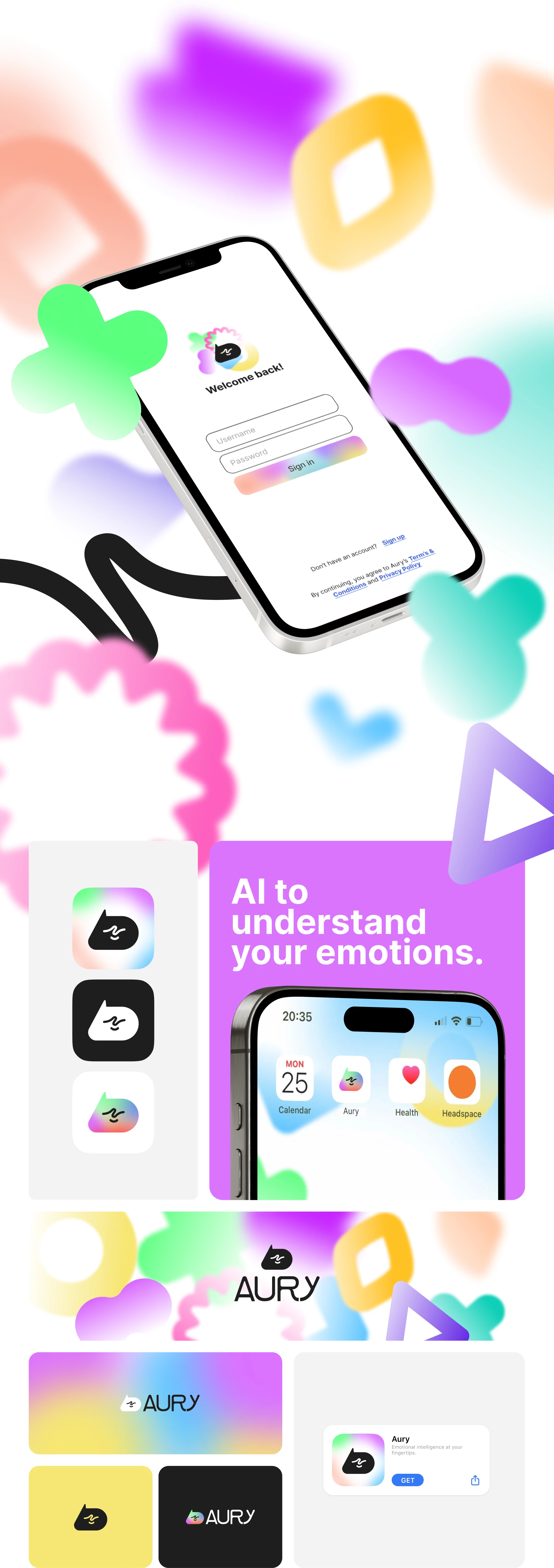
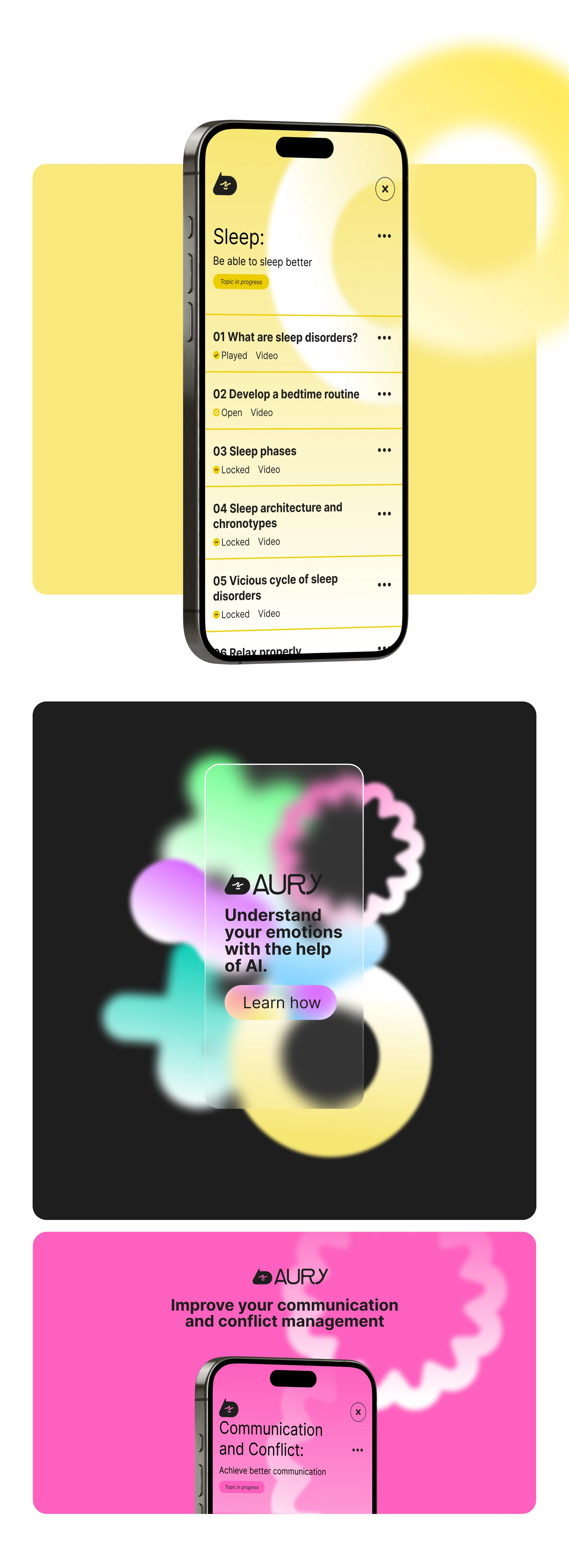
A mental health app AI companion backed by European researchers. Entirely designed by me. Branding, interactions, user journey, UX, marketing and a basic design system.
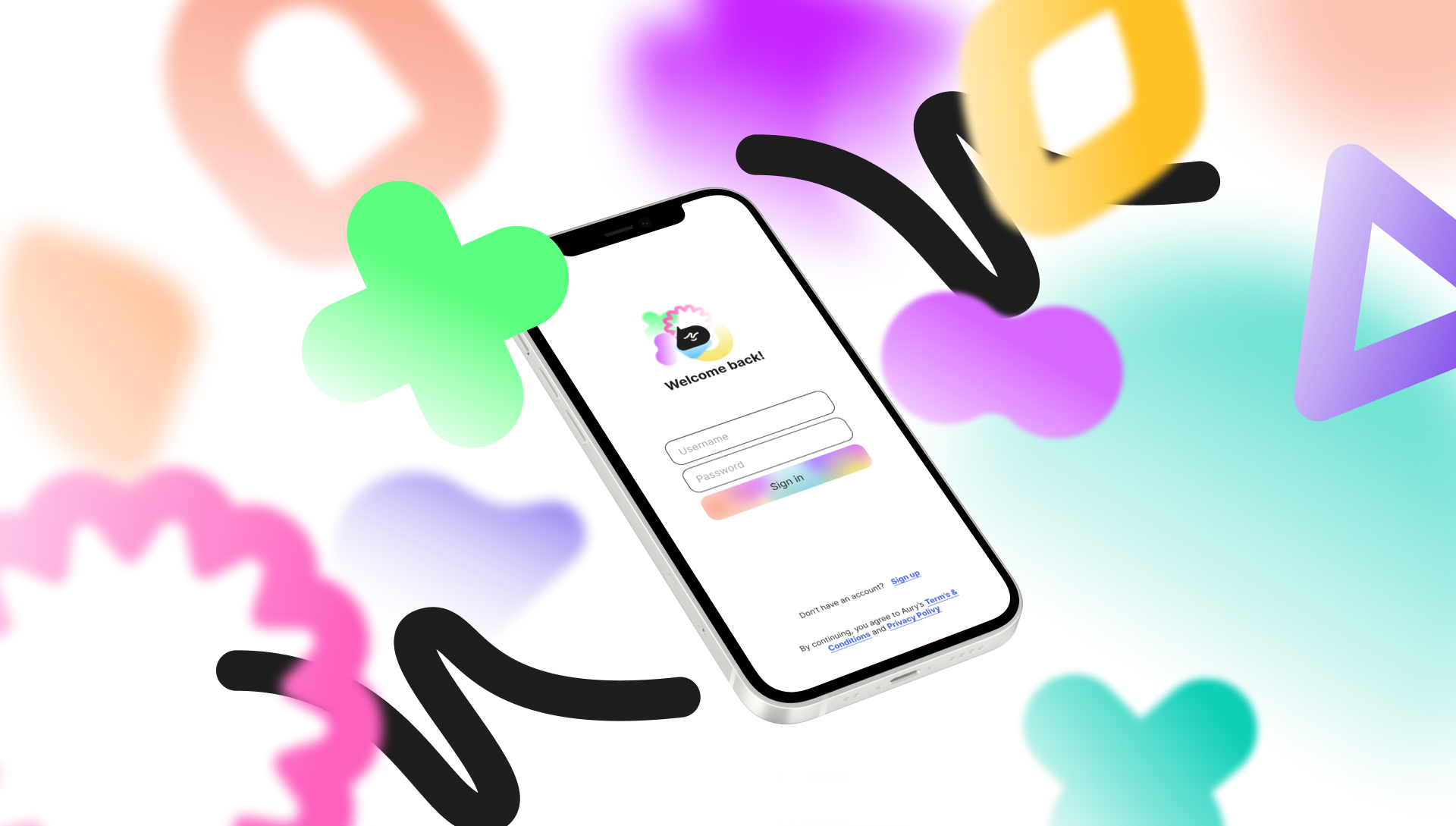
Designing trust at the hardest moment to earn it
Aury is a conversational AI designed to support people dealing with stress, anxiety, and burnout — developed by clinical psychologists in Germany, grounded in CBT, ACT, and mindfulness, and built to strict European data and regulatory standards. Its ambition is significant: to give access to psychological support to the billion people who currently have none.
The design challenge was unusually high-stakes. Mental health is among the most sensitive contexts a product can operate in. Users arrive at Aury when they’re already struggling — tired, anxious, sometimes in genuine distress. The design has to earn trust before it earns engagement. A single jarring interaction — the wrong tone, an unclear prompt, a UI that feels clinical and cold — and the user closes the app and doesn’t come back.
“In mental health, the design is the therapy. If the interface feels unsafe, the conversation never happens.”
My previous work in healthcare products gave me a framework for this kind of constraint: you’re not just designing usability, you’re designing emotional safety. Every decision — colour, typography, copy, interaction pattern — is a signal that either builds or erodes the user’s confidence that this space is for them.
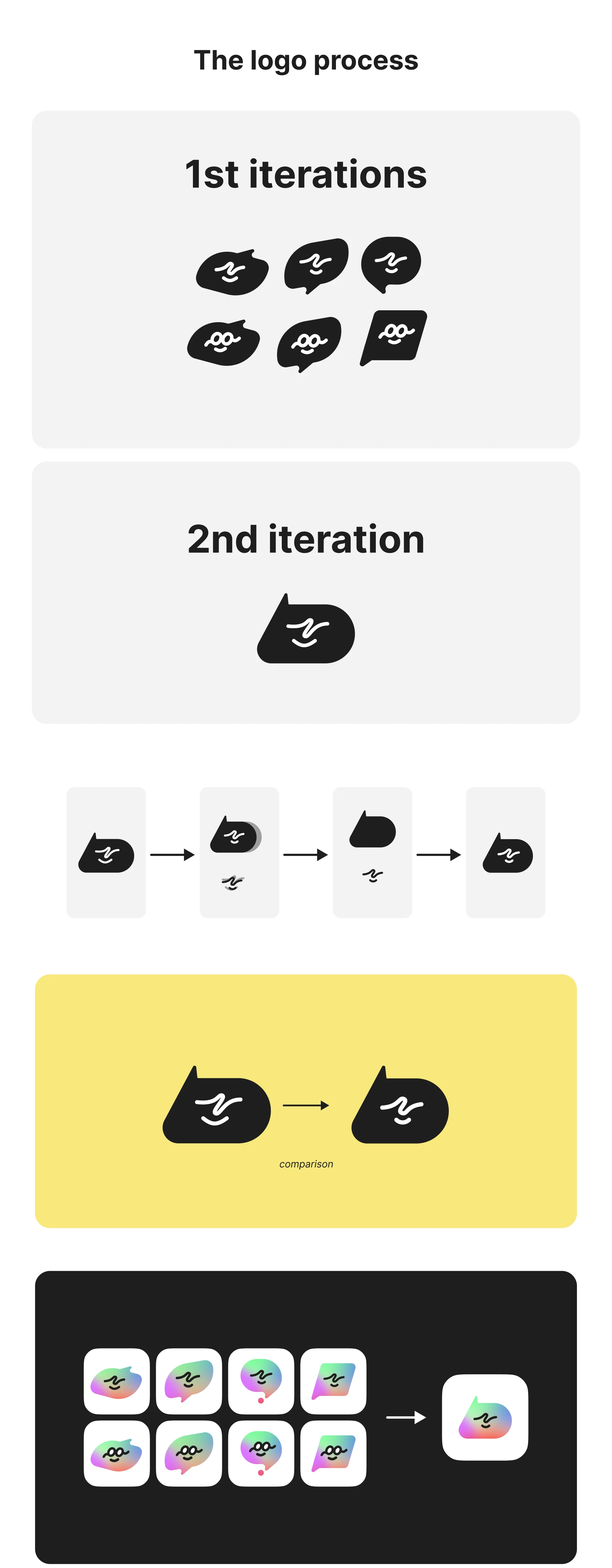
Everything, from the logo to the conversation
Working directly with the two founders, I owned the full design surface of the product — there was no handoff, no second designer, no agency. Every creative decision came through this collaboration.
A brand that had to feel safe before it felt smart
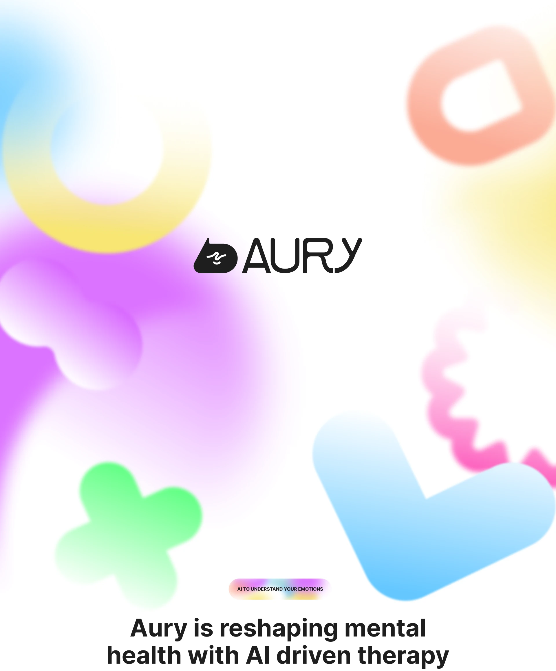
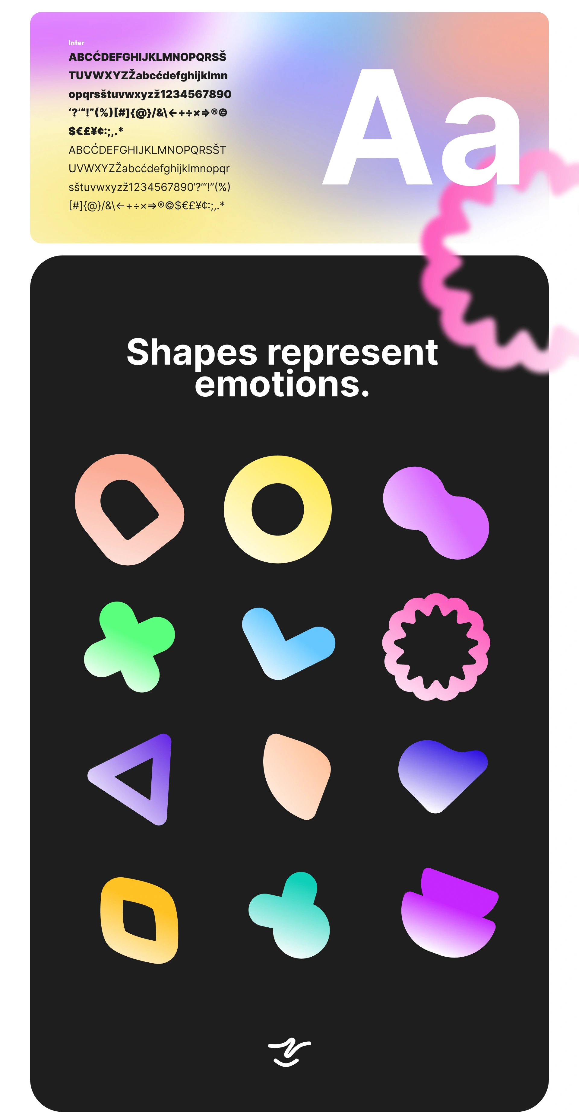
The mental health space is split between two visual extremes: sterile clinical whites that feel like a waiting room, and over-saturated wellness pastels that feel patronising. Neither was right for Aury.
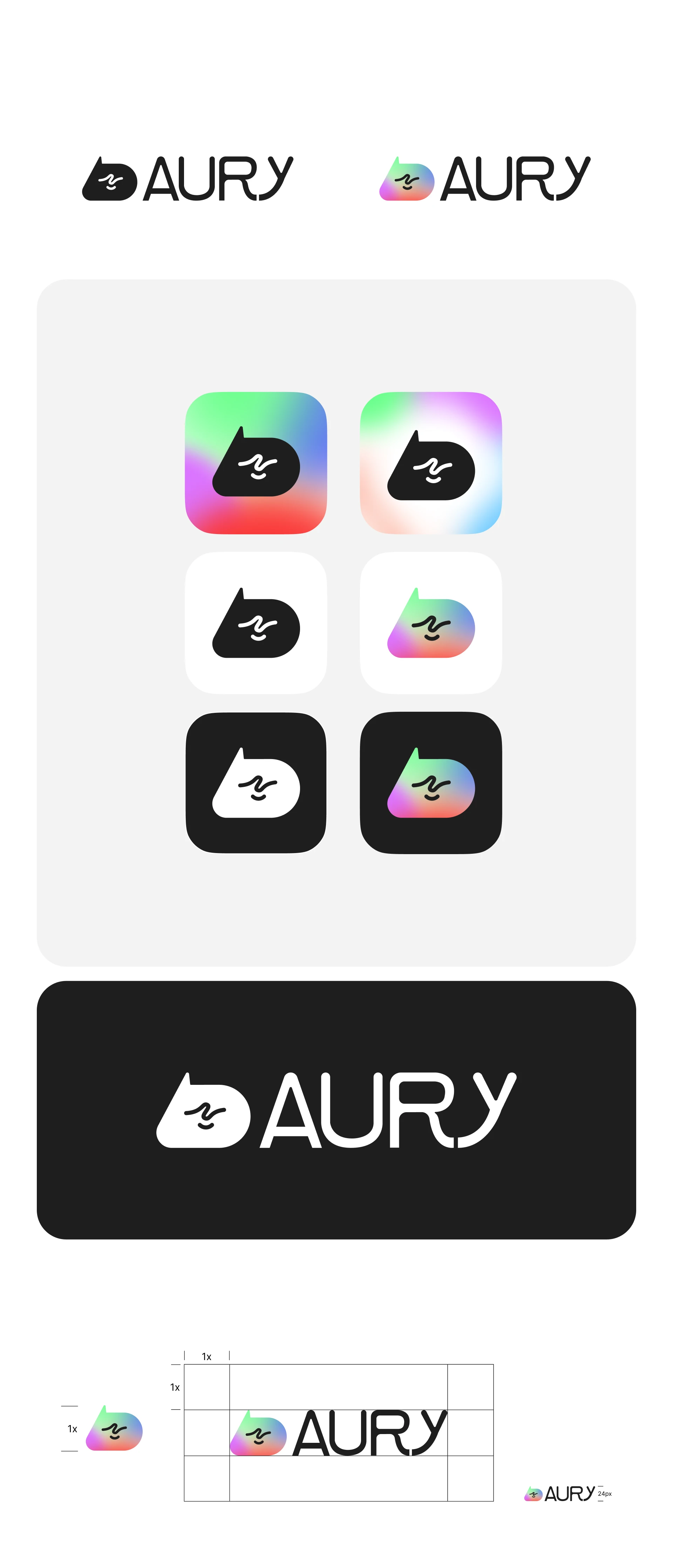
Aury needed to feel like a companion — warm enough to be approachable, restrained enough to feel trustworthy, and distinctive enough to stand out from both the clinical and the wellness-app aesthetic. The founders had built the product with clinical rigour and genuine care; the brand needed to communicate both simultaneously.
The three qualities the brand had to hold at once mapped directly from the product’s own principles: calm and safe (for users arriving in distress), scientifically credible (for B2B partners and health insurers), and human and warm (because the whole point is connection, not efficiency).
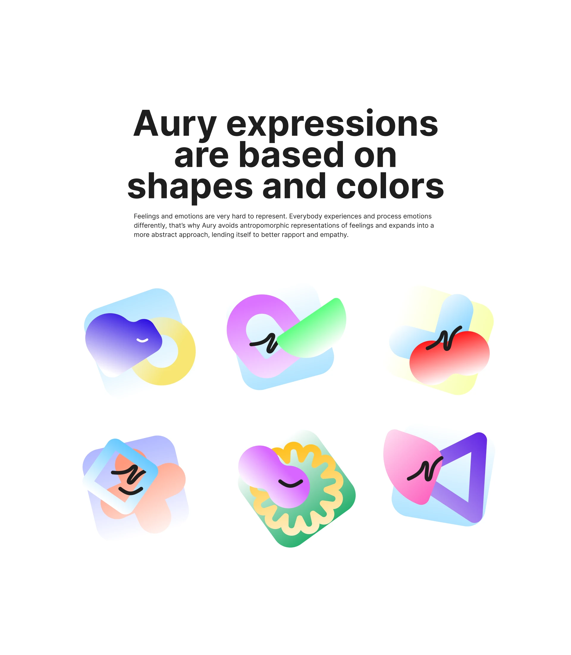
“Aury” — from “aura” — carries connotations of presence, atmosphere, and emotional resonance. The brand needed to honour that: not loud, not urgent, but unmistakably there. A companion with a personality, not a tool with a function.
Coral
HEX
#FBAA94
Lemon
HEX
#F7E677
Lavender
HEX
#DB74FF
Charcoal
HEX
#1E1E1E
Mint
HEX
#6AFF8B
Aqua
HEX
#6AC9FF
Cherry
HEX
#FF1515
Plum
HEX
#743EE7
Honey
HEX
#FFC226
Fuchsia
HEX
#FD74C6
Eggplant
HEX
#573FE7
Ocean
HEX
#0FD0B8
Violet
HEX
#C727FF
Designing a conversation that people trust with their worst days
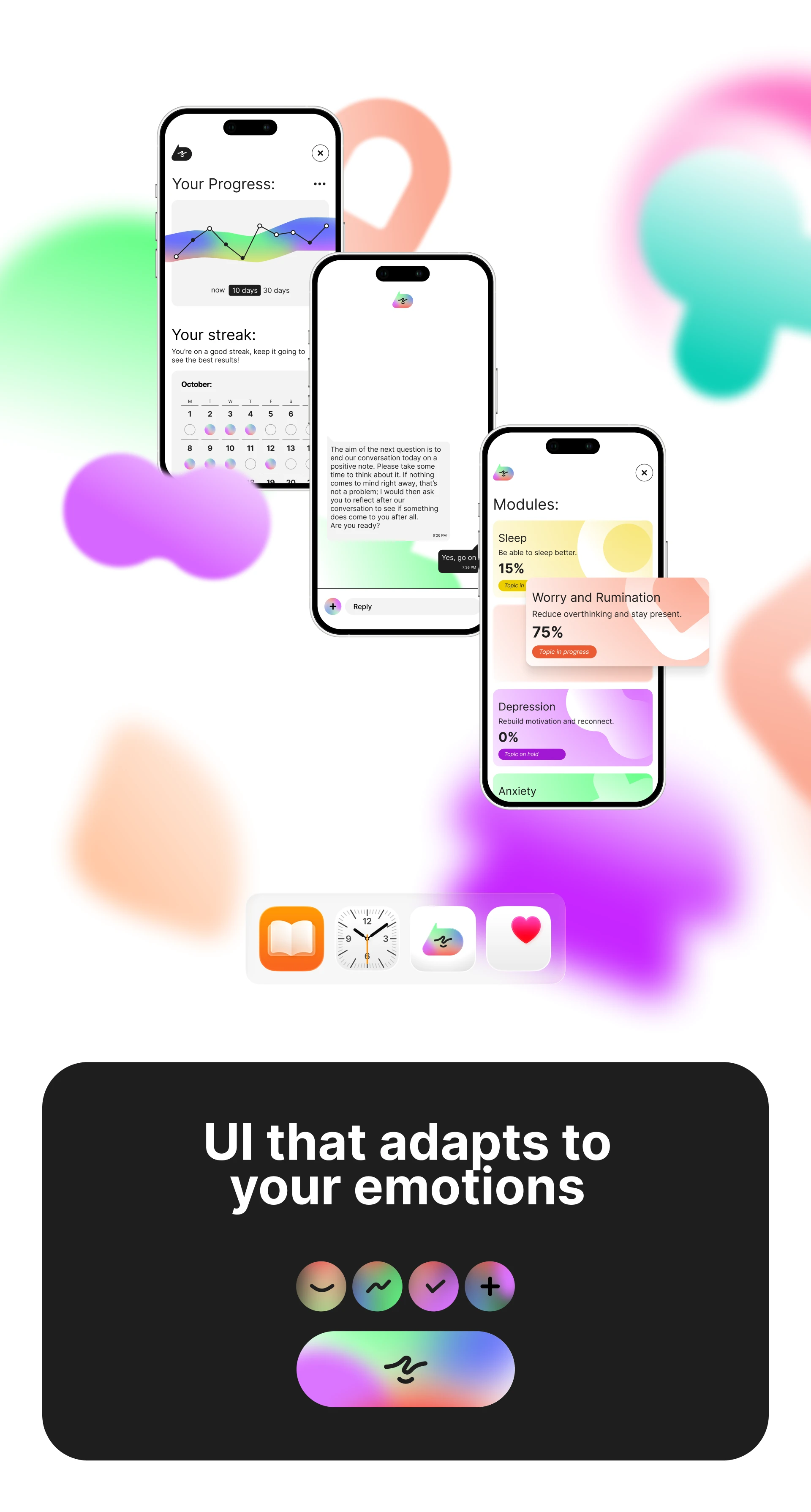
The core of Aury is a conversation. Unlike a standard chatbot UI — which is mostly a solved problem — a mental health conversation UI carries specific requirements that most chat interfaces aren’t designed for.
The interaction model had to feel guided but not scripted, supportive but not saccharine, and structured enough to deliver clinical value while remaining flexible enough to respond to what a user actually needs in that moment.
Key interaction decisions
Pacing over efficiency. Standard UX optimises for task completion speed. A mental health conversation optimises for the opposite — space to think, breathe, and respond honestly.
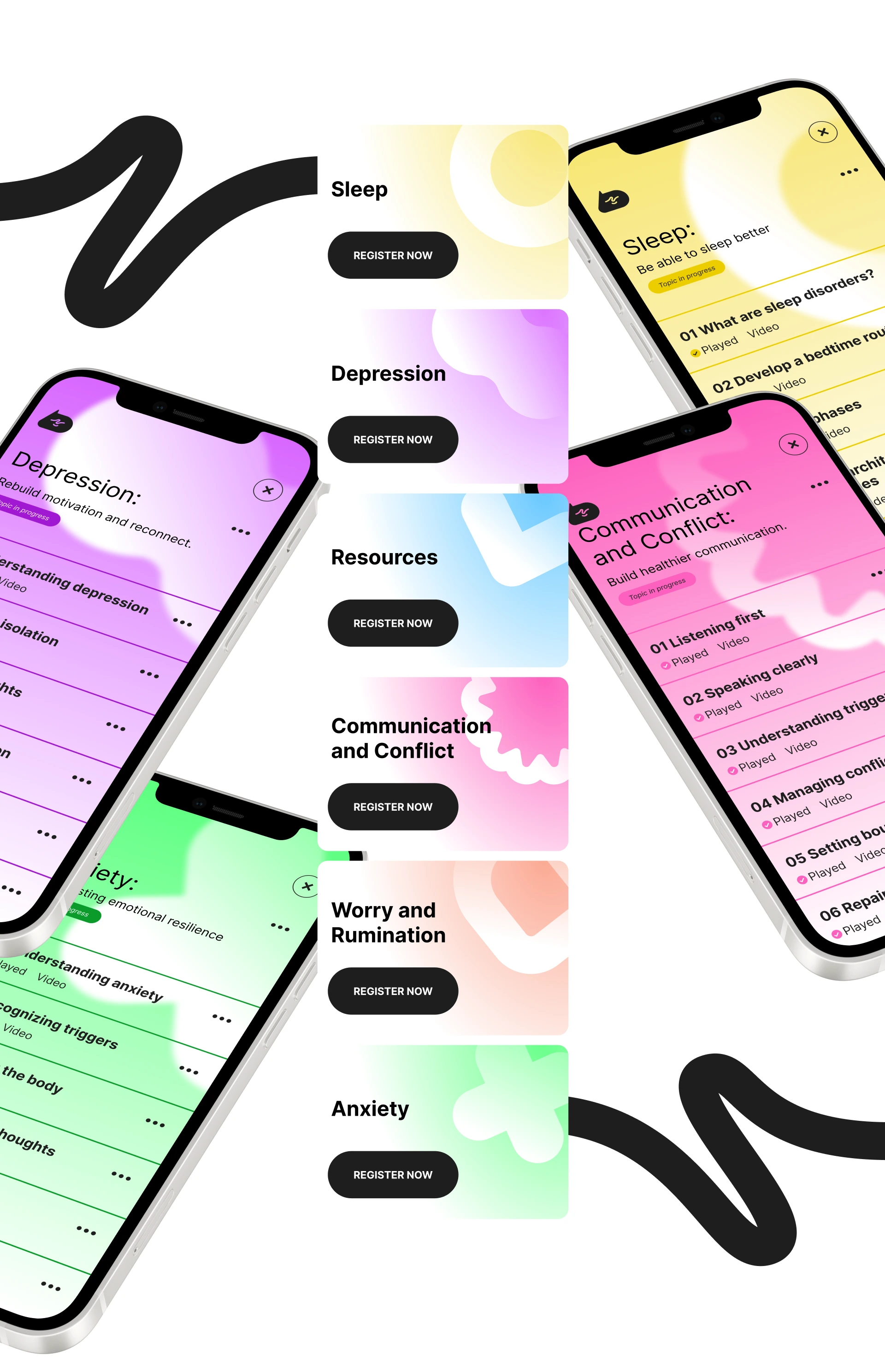
Structured sessions with open check-ins. Two distinct modes: structured 8-session course content and free-form check-ins. The UI handles both without making either feel like a compromise.
Trust signals embedded in the UI. ISO certification, GDPR compliance, EU hosting — surfaced as emotionally relevant context integrated at the moments users need them.
Crisis escalation as a design pattern. Aury scans for crisis indicators. The UI shifts register immediately: warm but direct, clear about limits, specific about where to get real help.
Honesty about what Aury is. Aury is not a therapist. These limits are designed into the product’s voice, onboarding, and escalation patterns — communicating them clearly is itself a trust signal.
A site doing two completely different jobs at once
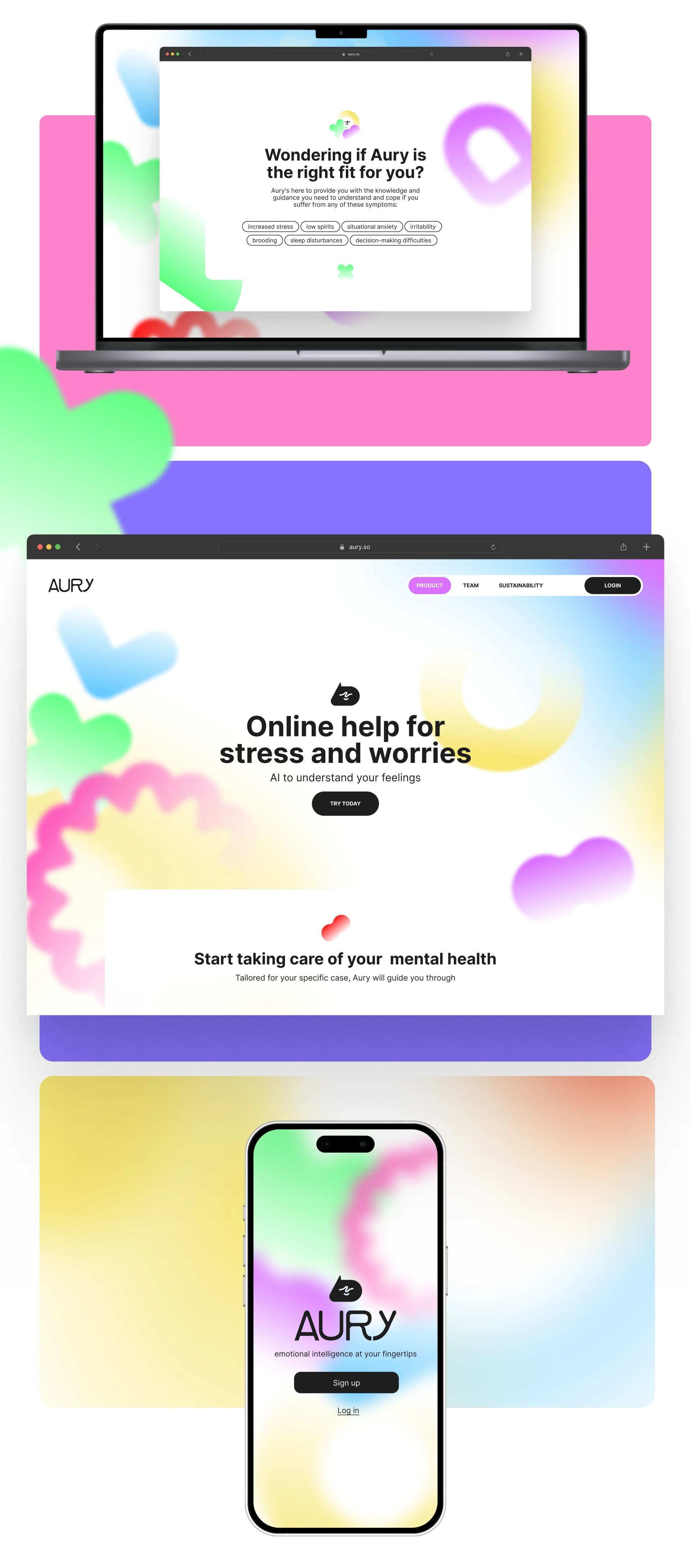
Aury’s marketing website has two separate audiences with fundamentally different needs: consumers who are anxious about whether this is safe to trust with their mental health, and B2B partners — health insurers, corporate HR platforms, healthcare companies — evaluating a white-label AI infrastructure investment.
These audiences need different information, different tones, and different conversion flows. The site architecture had to serve both without compromising either.
The consumer side
The consumer homepage leads with emotional utility — “Fühle dich besser” (Feel better) — not features or technical capability. The design prioritises use-case recognition over product explanation: rather than describing what Aury does, it presents the situations users are already in and lets them self-select. Safety and data protection are surfaced as emotional reassurance, not compliance footnotes.
The B2B side
The B2B platform page is a different product. Its audience is evaluating clinical credibility, regulatory compliance, integration feasibility, and commercial terms. The design reflects that: certification badges, a clear four-step go-live process, and industry-specific use case modules for health insurers, healthcare companies, and corporate clients.
The four-week go-live claim is a significant commercial differentiator. The design makes it visible and credible — not buried in a features list, but laid out as a concrete, step-by-step process that any technical stakeholder can evaluate.
Designing within one of Europe’s most demanding regulatory environments
Aury operates at the intersection of multiple regulatory frameworks — GDPR, the EU AI Act, ISO 27001, ZPP (Germany’s prevention course certification), and a roadmap toward MDR medical device classification. For any of these to be meaningful to users and partners, they had to be communicated through design, not just documented in legal pages.
My healthcare background informed how these were handled in the design. In regulated health products, compliance isn’t a footnote — it’s a primary user need. The design integrates these signals at the exact moments they’re needed: onboarding, the B2B platform page, and the safety page.
In health products, the safety information is product design. The page that explains what Aury cannot do — crisis escalation, explicit limits, emergency contacts — isn’t a legal disclaimer. It’s a critical part of the user experience.
What the product earned from users
The most direct validation of a conversation UI designed for mental health is whether people actually feel heard by it. Aury’s users provided unprompted feedback that speaks directly to the design decisions made throughout the product.
“The conversation was really good and could have happened with a real person.” — Anonymous Aury user, Nov 2025
“It’s good to have someone like you, where I know it will never be too much and I can write to you at any time.” — Anonymous Aury user, Oct 2025
“There were points that touched me deeply and made me think.” — Anonymous Aury user, Dec 2025
“Especially if you’re a little shy, it helps to speak online.” — Anonymous Aury user, Jul 2025
All testimonials are from anonymous users. Translated from German.
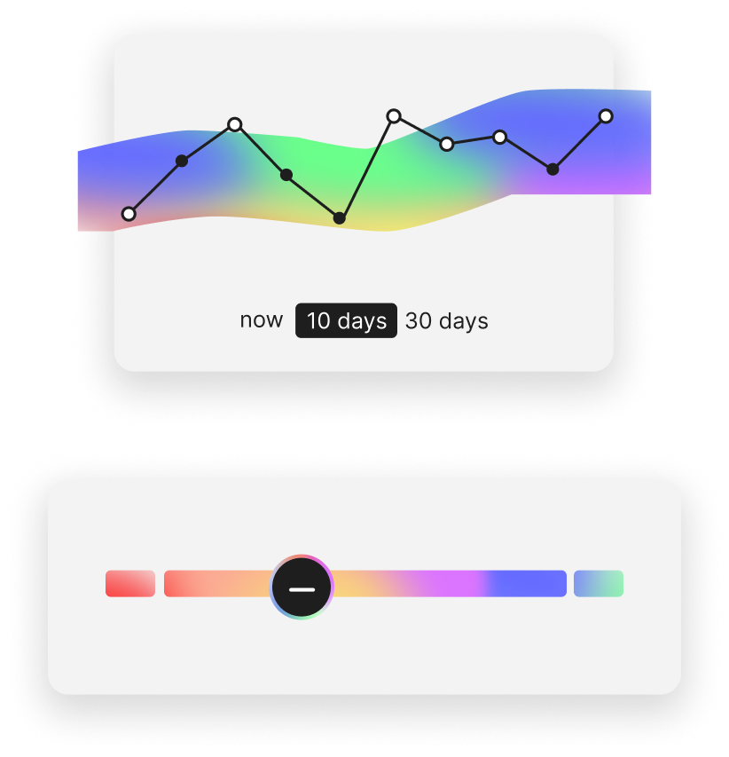
Keeping track of your mental health
Users can monitor their emotional patterns over time with an intuitive chart view, toggling between different time ranges to understand how they've been feeling.
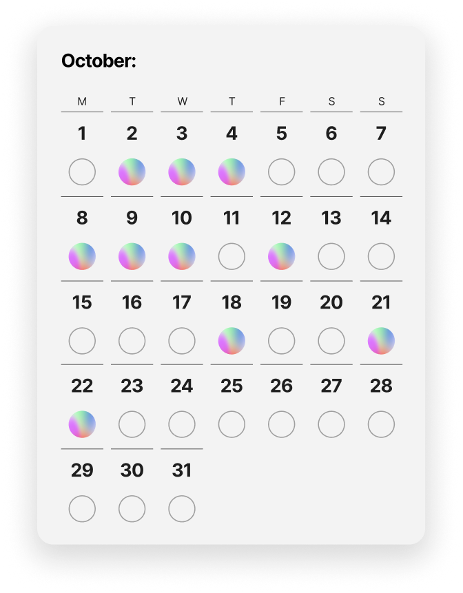
User can view their commitment
A calendar view lets users see their engagement history at a glance — each day they interact with Aury is marked, building a visual record of consistency and progress.
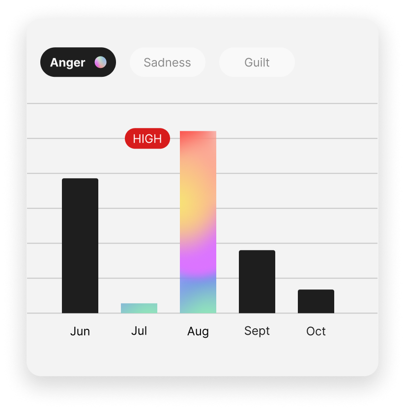
Understand your emotions over time
Detailed emotion tracking breaks down specific feelings — anger, sadness, guilt — month by month, helping users and their care team identify patterns and triggers.
What designing for mental health changes about how you work
More work
WWF - The Tree of Hope
A text-based RPG on WhatsApp, huh? A game about a ninja saving forests on WhatsApp? Yes.
View case study →