Galactic Garrison
Personal project that includes illustration, design systems and website building
Galactic Garrison is a colossal modular illustration library — armors, helmets, weapons, chapters and accessories inspired by the Warhammer 40K universe, built entirely in Figma. A personal project that applies professional design system thinking to something with no brief, no client, and no rules.
View Live →Team
Juan Felipe Cadavid

What happens when a product designer builds something only for themselves
Every professional project comes with constraints — client briefs, stakeholder reviews, scope documents, sprint deadlines. Galactic Garrison has none of those. It exists because Warhammer 40K has one of the richest visual universes in fiction, and the wargaming community around it produces extraordinary creative work — custom paint jobs, original chapters, hand-built miniatures — that deserved a design tool worthy of it.
The premise is simple: a fully modular Figma library that lets anyone build their own customised space soldier — picking helmets, armors, weapons, shoulder pads, chapter badges, and accessories, all composable in Figma without any design expertise required.
The same system thinking I apply to UI component libraries turns out to work perfectly for building a modular illustration kit. The medium changes. The architecture doesn't.
This is where the product design dimension becomes interesting: building a library that non-designers can use fluently requires exactly the same discipline as building a UI component library for non-designers. Variants, auto-layout logic, composability, naming conventions, discoverability — all the same problems, entirely different subject matter.
One project, three areas of craft
Galactic Garrison sits at the intersection of three distinct skill areas. Understanding each one separately is what makes the whole project legible as a professional case study rather than just a hobby.
A style that had to work at miniature scale and system scale
The Warhammer 40K universe has decades of official art, miniature designs, and community interpretations to draw from. Developing an illustration style for Galactic Garrison meant finding a lane that was clearly in conversation with that universe — familiar to the community — while being distinctly its own thing.
The answer was a bold vector style with strong silhouettes, flat fills, and high contrast — closer to a sticker sheet or enamel pin design than to the painterly detail of official Warhammer art. This choice was functional: simpler forms are easier to modularise, easier to recolour, and easier for community members to adapt to their own chapter schemes.

The MKVII pack — one helmet design rendered across multiple chapter colour schemes. Consistent silhouette, infinitely recolourable.

Weapons pack — each weapon illustrated as a standalone component that attaches to any soldier configuration.

The Twilight Stalkers pack — a community-inspired faction with its own distinct silhouette language.
Each content pack is both a standalone creative release and a system addition. New packs extend the library's combinatorial possibilities — a new helmet works with every existing armor, every existing weapon, every existing chapter badge. Every new piece multiplies the number of possible soldier configurations, not just adds one.
Building a component library where the components are soldiers
The Galactic Garrison Figma library is architecturally identical to a professional UI component library — it just happens to contain space marines instead of buttons. The same problems apply: how do you organise hundreds of components so someone who's never used Figma before can find what they need? How do you handle variants? How do you make recolouring work without breaking the system?
Every piece of the soldier is an independent, self-contained component with its own variants. They combine freely — you compose a soldier the same way you compose a UI screen.

The library in Figma — components organised for discoverability and composability, the same way a professional UI system would be.
Designed for people who don't know Figma
A significant part of the target audience — Warhammer hobbyists and miniature painters — have never used Figma. Component naming follows community vocabulary, not design system conventions. The drag-and-drop workflow was prioritised over anything that requires knowledge of Figma's more advanced features. The goal was zero learning curve for the creative part — the only friction should be discovering Figma itself, not navigating the library.
A product built for the community and inspired by it's creators
A Figma file sitting in isolation isn't a product. Galactic Garrison has a website, a brand identity, an Instagram presence, an early-access model, and — most importantly — a community contribution system that makes the library grow beyond what one person can build.
The library is free. This wasn't a default — it was a deliberate product decision. The Warhammer 40K community is enormous, global, and already generous in sharing creative work. Charging for access would shrink the audience, reduce community contributions, and position the project as competing against Games Workshop's ecosystem. Free positions it as a community tool.
Over 20 community creators are credited in the library. The contribution model is explicit: anyone can DM the Galactic Garrison Instagram account to request their chapter be built into the library. Contributors become invested users, and invested users bring their communities. The library grows faster than one person could build alone, and every new community chapter represents someone with a personal stake in the project's success.
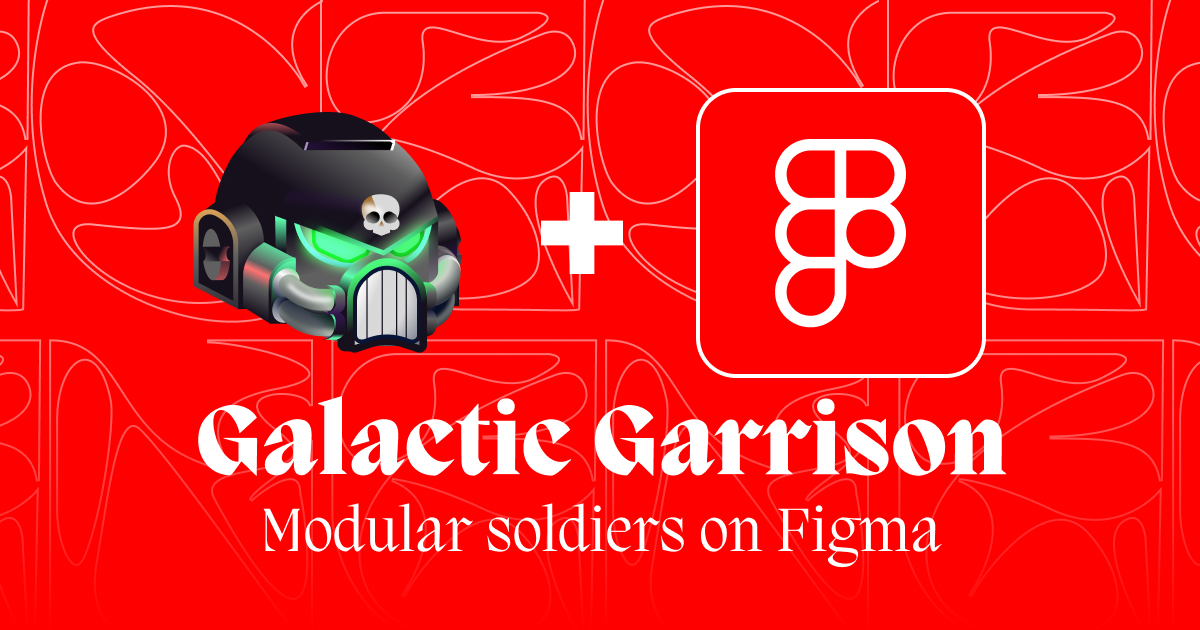
Galactic Garrison lives in Figma — the platform choice shaped everything from the access model to the composition workflow.


Where the Garrison is going
Galactic Garrison is explicitly in progress. The roadmap reflects how the project scales both as a creative system and as a product — from Figma library, to multi-platform tool, to physical goods.


What building for fun teaches you about building for work
More work
charles
charles needed to stop looking like every other SaaS tool in the room. Two website redesigns, a full rebrand, a commissioned custom typeface, and a design system that the entire company could use — this is what it took.
View case study →PIE Design System
A complete design and engineering infrastructure. From foundations, components, patterns, platform support, to tooling.
View case study →