charles
Led the end-to-end rebrand and product design system. Charles went from a generic SaaS tool to a distinctive, scalable brand.
charles needed to stop looking like every other SaaS tool in the room. Two website redesigns, a full rebrand, a commissioned custom typeface, and a design system that the entire company could use — this is what it took.
Team
Maxine Hess
Andrey Frolov
Etienne Kiefer
The ultimate indicator? Competitors started copying the visual language within months of launch.
A product with real differentiation, hiding behind a generic face
charles is a WhatsApp commerce platform — it helps businesses turn one-to-many messaging into personalised, revenue-generating conversations. Unlike email newsletters, WhatsApp campaigns are interactive, conversational, and achieve engagement rates that email can't touch.
The product was genuinely different. The brand wasn't. When I joined, charles looked like every other B2B SaaS company: a royal blue palette, stock photography, overly formal copy, and a visual identity that said nothing distinctive about what the product could do.
The opportunity wasn't just to make things look better — it was to build a brand with genuine personality that would attract the right customers, make sales conversations easier, and give the whole company a shared creative foundation to work from.
"The B2B marketing space is muddled with safe choices. Our competitors aimed for professional and landed on forgettable. We saw that as an opening."
Three problems to solve simultaneously
01 — The brand had no clear point of view. There was no visual language strong enough to be recognisable, consistent, or memorable. Every asset — decks, ads, website — felt like it came from a different company.
02 — The website wasn't converting at the level the product deserved. Traffic was growing but the site lacked narrative clarity. Visitors understood the feature, not the value. The tone of voice was stiff and impersonal for a product built around conversation.
03 — The creative team was a bottleneck for every asset. Sales, marketing, and product teams were either waiting on designers or producing off-brand materials independently. There was no system that let non-designers produce consistently branded work.
Building a brand around a character, not a feature
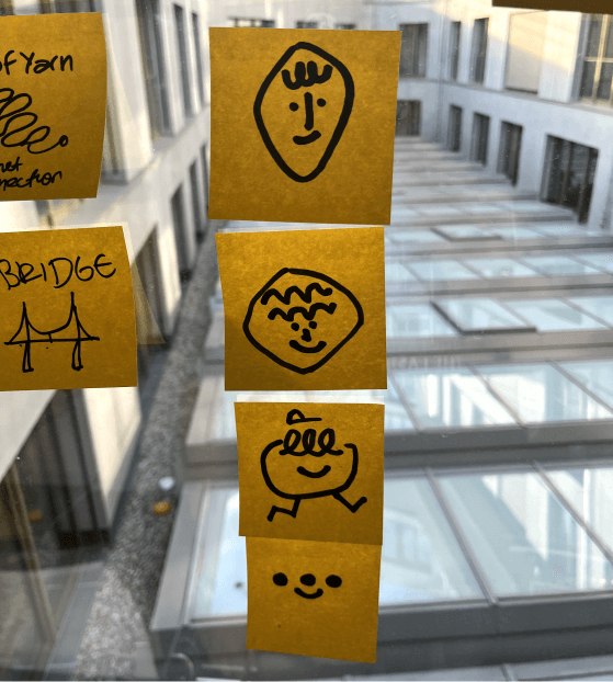
The name "charles" already implied a personality — a companion, a trusted advisor, a witty collaborator. Internal surveys, customer interviews, and stakeholder workshops all converged on the same perception: people related to the product like it had a character.
That insight became the creative brief. Rather than designing a logo that explained WhatsApp marketing, we designed one that embodied a personality. The character concept won across every review session — it was the most distinctive, most recalled, and most differentiated direction.
The final logo
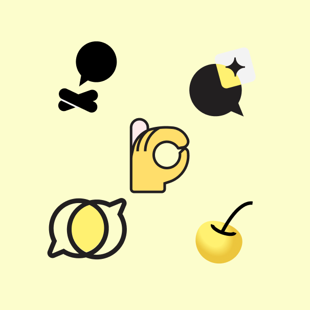
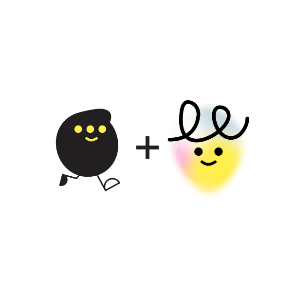
The mark distills the character concept into something simple enough to work at favicon size and bold enough to anchor a billboard. Variations were developed for light and dark contexts, monochrome reproduction, and co-branding scenarios.
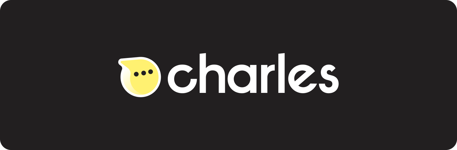

Full logo system — primary, secondary, icon-only, and reversed variants.
A typeface that couldn't belong to anyone else
Typography is the voice of a brand in written form. Using a licensed typeface meant that voice was shared with every other company that had a license. We wanted something that was genuinely and only charles.
We commissioned Kulture Type to design two custom typefaces: charles sans — a clean, characterful workhorse — and charles inktrap, a display variant with optical corrections that gives editorial layouts a distinctive edge.
Why a custom typeface? A custom typeface is not a vanity spend. It's a permanent competitive moat. Every time a competitor uses a generic sans-serif and charles uses its own type, the gap in brand perception compounds. Typography touches every single pixel of every single asset — it's the highest-leverage brand investment you can make.
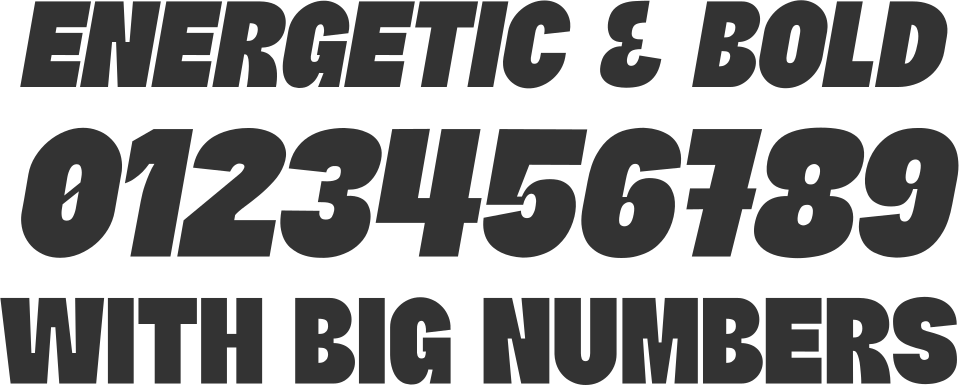
charles sans — the brand's primary voice across all touchpoints
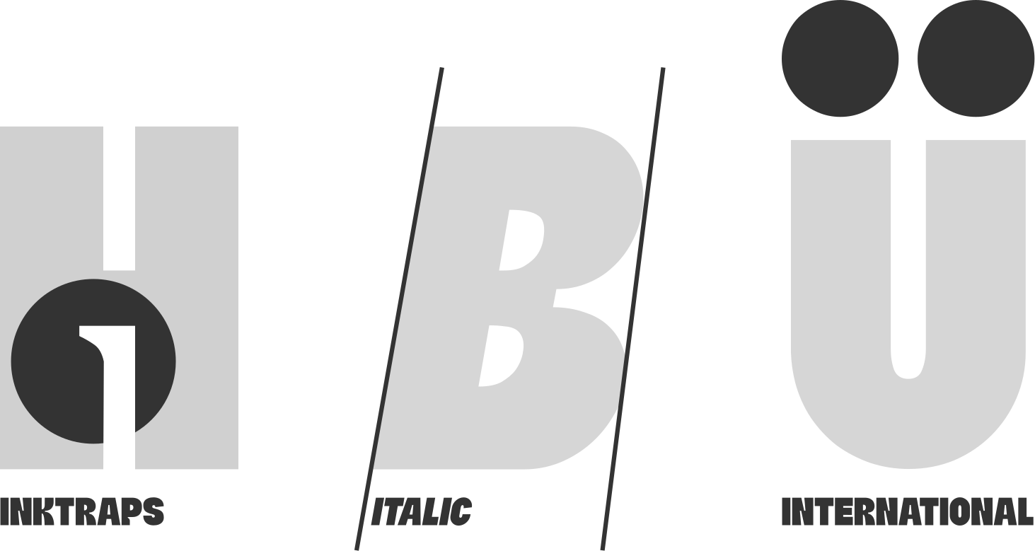
charles inktrap — the editorial display face, designed for high-impact headlines
A website that earns its traffic
I had already redesigned the charles website once when I joined. The first redesign established structural and UX improvements — better information architecture, clearer value proposition, faster load times. But once the rebrand was complete, the site needed a full second redesign to carry the new visual language.
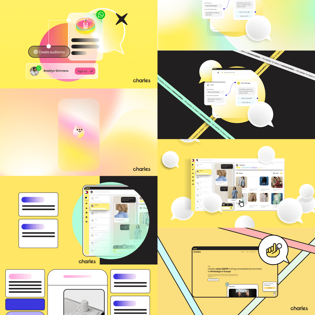
The brief for the second redesign was unambiguous: the website should feel unlike any other B2B marketing tool on the internet. Bold colour, confident copy, editorial-quality layout, and a tone that matched the product's conversational personality — not the corporate register of its competitors.
Colour as a differentiator. Most B2B SaaS tools use muted palettes to project "enterprise trustworthiness." We inverted this: a rich, warm palette that reads as confident and energetic, not cautious.
Copy written for humans, not procurement teams. The old site spoke about features. The new site speaks about outcomes. We rewrote every page to prioritise the business results customers care about, in the direct, conversational tone that matches the medium charles operates in.
Custom type as a structural element. charles sans and charles inktrap don't just set body copy — they define section rhythm and hierarchy throughout the site, making the typography itself a distinctive visual element.
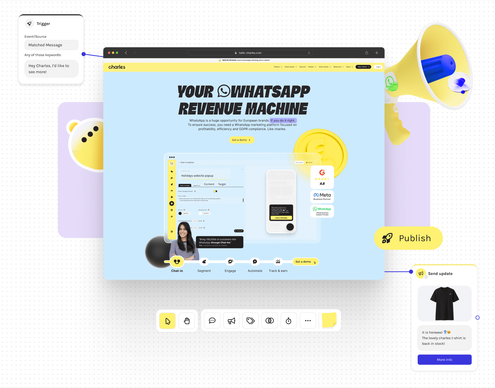
The redesigned charles.com — built on the new visual language and component system.
A system the whole company could use without a designer in the room
The hardest problem in brand consistency isn't design quality — it's distribution. If the only way to get a properly branded asset is to submit a request to the design team, the brand will leak everywhere the design team can't reach.
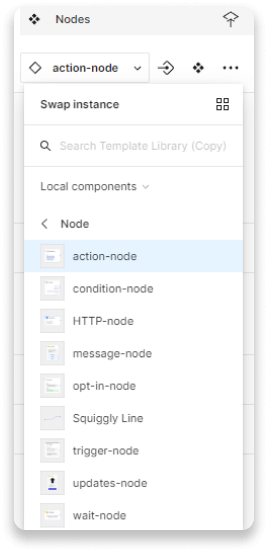
I built a component library in Figma with one primary constraint: any team member, with no design background, should be able to pick up a component, edit its content, and produce something that looks right. No design review required.
"The best design system is one where there's no way to accidentally make something off-brand."
01 — Website components for faster iteration. All major web modules — hero sections, feature grids, testimonials, CTAs — are available as auto-layout components that resize correctly and snap together predictably. New page concepts can be sketched in an afternoon.
02 — Presentation templates for sales and client teams. Sales could now build fully branded decks without waiting on the creative team. Slide templates use the same components and type styles as the website, so brand consistency is structural, not a matter of discipline.
03 — Social media and ad templates. Sized for every key placement — Instagram feed, Stories, LinkedIn — with content-editable text layers and swappable assets. The marketing team could run campaigns at speed without briefing the design team for each post.
04 — Product team adoption. The library extended into the product itself. Product designers adopted the same foundations — colour tokens, type styles, spacing — so the brand experience carried through from marketing to in-app.
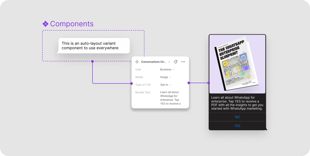
The core component library — every module built with auto-layout, variants, and text-style enforcement.
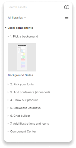
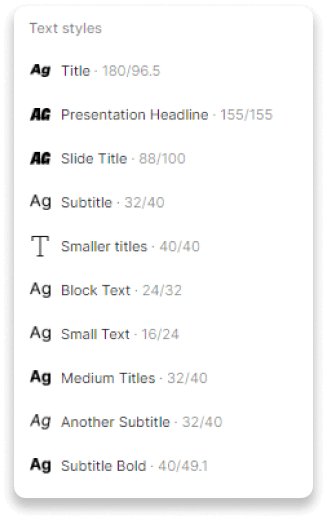
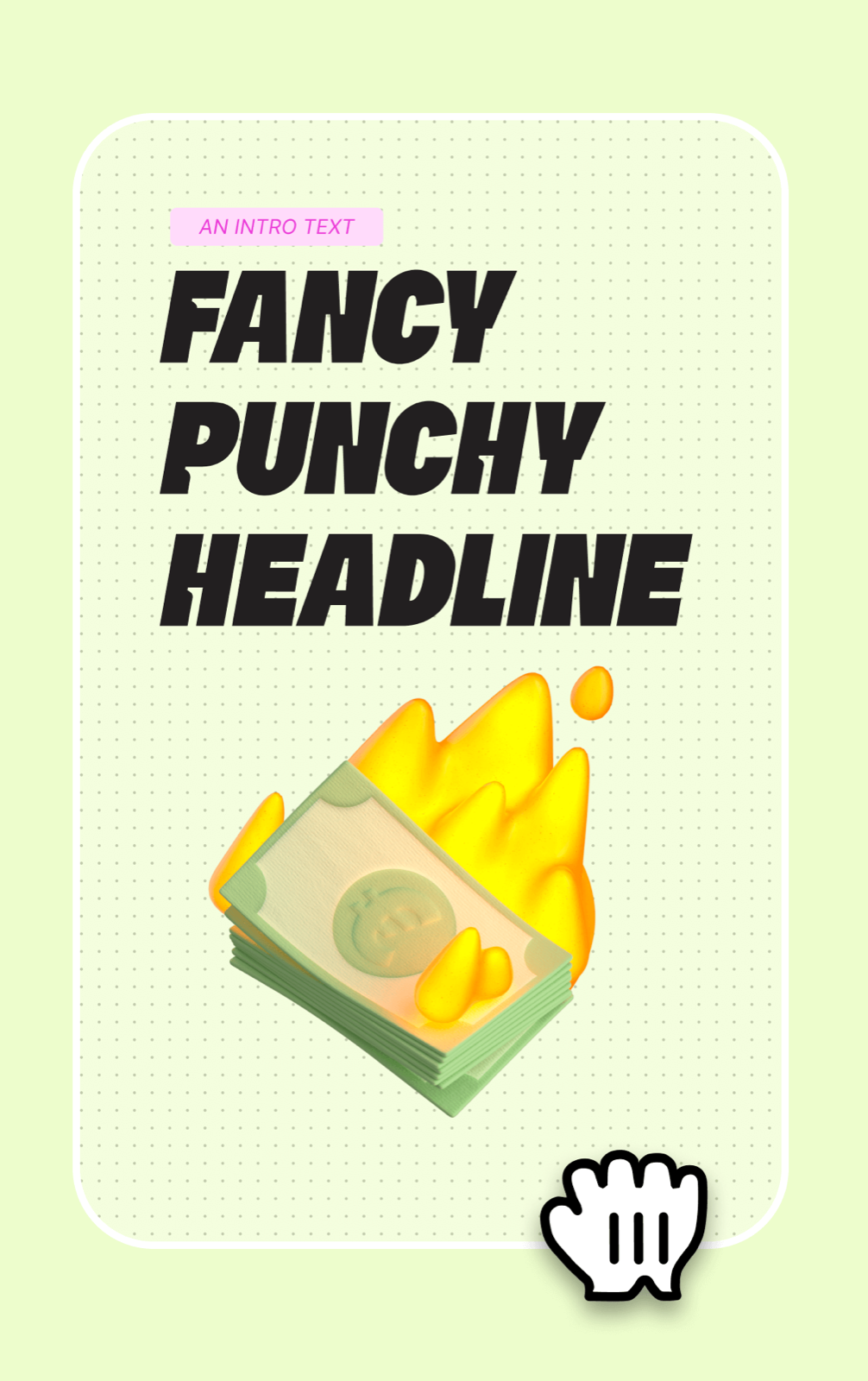
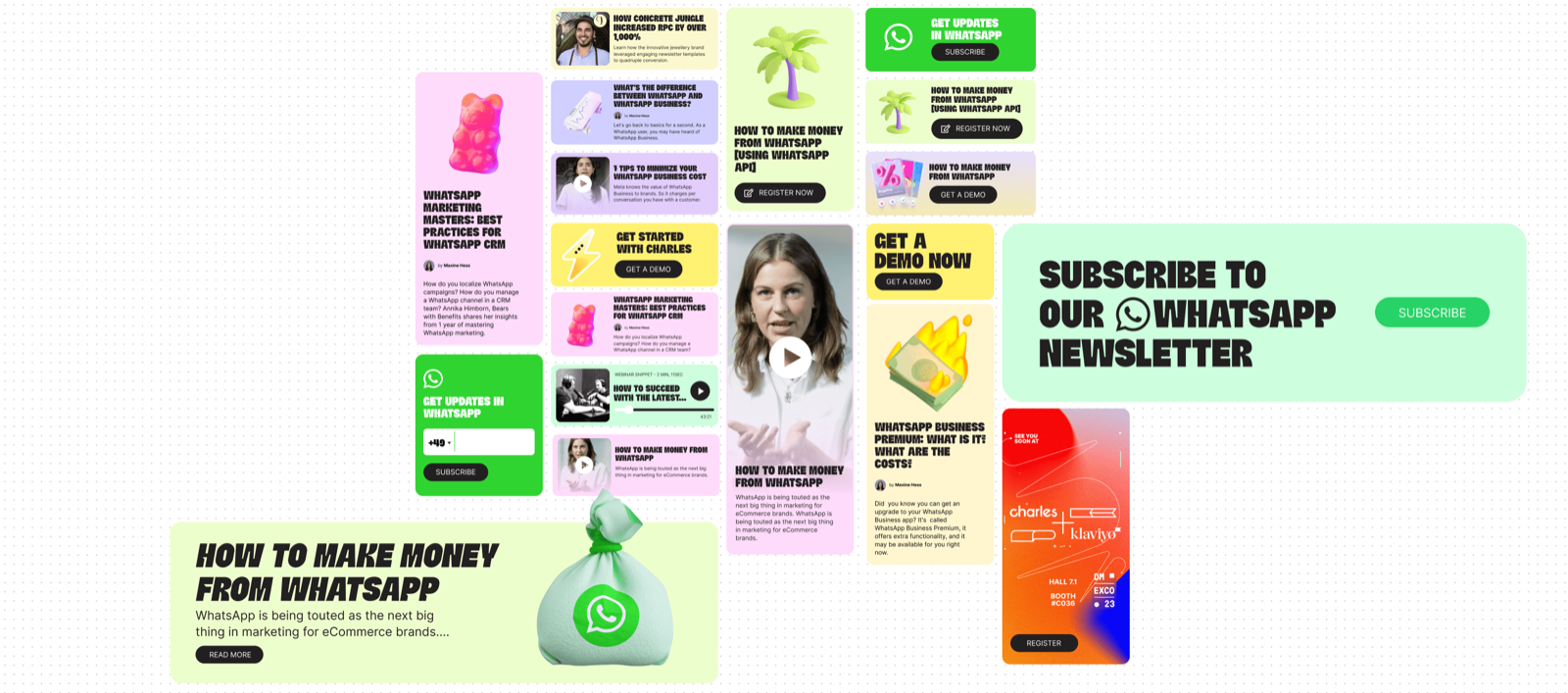
Website component set — flexible enough for new sections, constrained enough to stay on-brand automatically.
Documentation that people actually use
A brand guideline document that lives as a PDF and gets emailed around is a guideline document that gets ignored. I built the charles brand guidelines as a living Figma prototype — interactive, always up to date, accessible to anyone in the company from a single link.
The guidelines covered logo usage, colour application, typography, tone of voice, photography direction, component usage principles, and the rules for when and how to deviate from them intentionally.
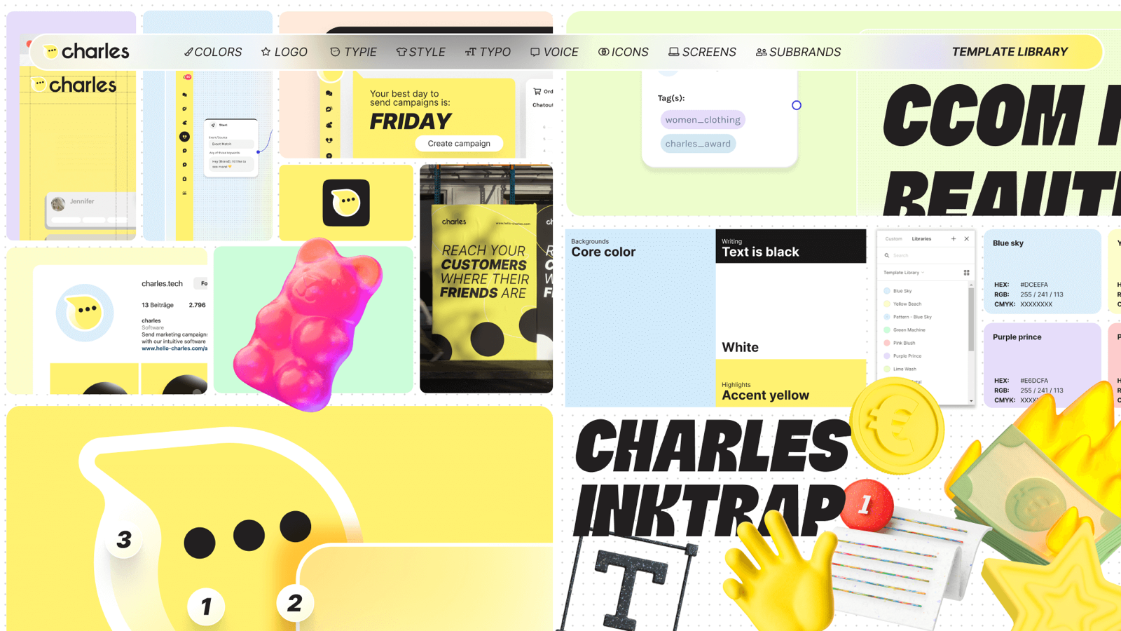
Brand guidelines as a living Figma prototype — not a PDF. Always current, always accessible.
Advertising that pushed the brand forward
Social media and paid ads aren't just distribution — they're where a brand gets tested against real-world attention. I used the ad formats as an active lab for evolving the visual language: pushing the colour, trying new compositions, experimenting with the character-led approach in motion.
The most successful executions fed back into the core brand, keeping it dynamic rather than static. A brand that never evolves from its guidelines eventually looks stale — the ad channel was a safe place to discover what was next.
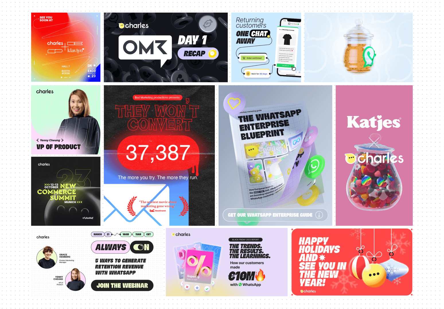
Campaign assets across Instagram and LinkedIn — using the brand to stand out, not blend in.
What this project taught me
This was the most comprehensive brand and product project I've worked on, and it produced a few lessons that have changed how I approach every project since.
Systems thinking is more valuable than pixel perfection. The most impactful thing I built wasn't a single beautiful screen — it was infrastructure that let everyone produce beautiful screens without me. Scalable quality beats exceptional one-offs.
Brand bravery in B2B is an untapped competitive advantage. Every competitor was optimising for "professional." We optimised for memorable. The copycat behaviour from competitors within months of launch confirmed we'd found a genuinely open space.
Typography is the most underestimated investment in brand design. The custom typeface returned value on every single asset for the entire life of the brand — it's permanent differentiation at zero marginal cost per use.
Guidelines that live where people work get followed. PDFs don't. Moving the brand documentation into a Figma prototype reduced brand deviations not because we enforced rules harder, but because the right thing became the easiest thing.
What I'd do differently: I'd invest more time earlier in tone-of-voice documentation. Visuals scaled across the company faster than the written voice did — that gap was visible in early sales decks, and took longer to close than it should have.
More work
PIE Design System
A complete design and engineering infrastructure. From foundations, components, patterns, platform support, to tooling.
View case study →Tragic Card Gathering
Sweat blood and tears of social media posts and client work have brought you this new Trading Card Game from the mind behind that Purple Dude you've probably seen online.
Start collection →